
The Monongahela Supply Co. was a speakeasy-themed bar directly beneath Morgantown Brewing Company, a craft beer brewery and restaurant. They needed a logo for their social media channels and for print materials.
While the speakeasy was owned and operated by Morgantown Brewing Company, the latter already had a very distinct brand identity: upbeat, playful, and illustrative. The Supply Co. was intended to be more discrete, reserved, and mysterious, so it needed a different approach.
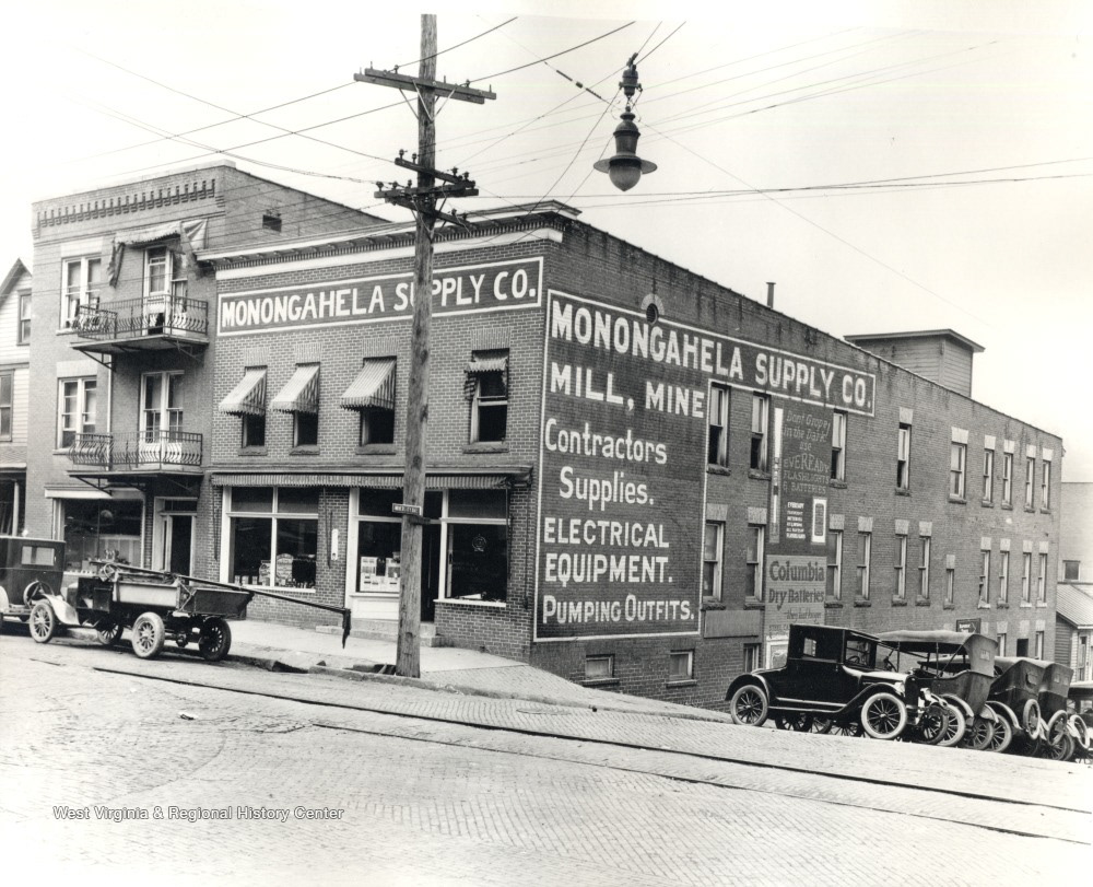
In the 1920s, the Monongahela Supply Co. existed mainly for distributing equipment and pumping outfits to contractors, a historic part of Morgantown, WV. 100 years later, the building was Morgantown Brewing Company; the entrance to the speakeasy is a door on the side in the basement of the building (where the stagecoaches are).
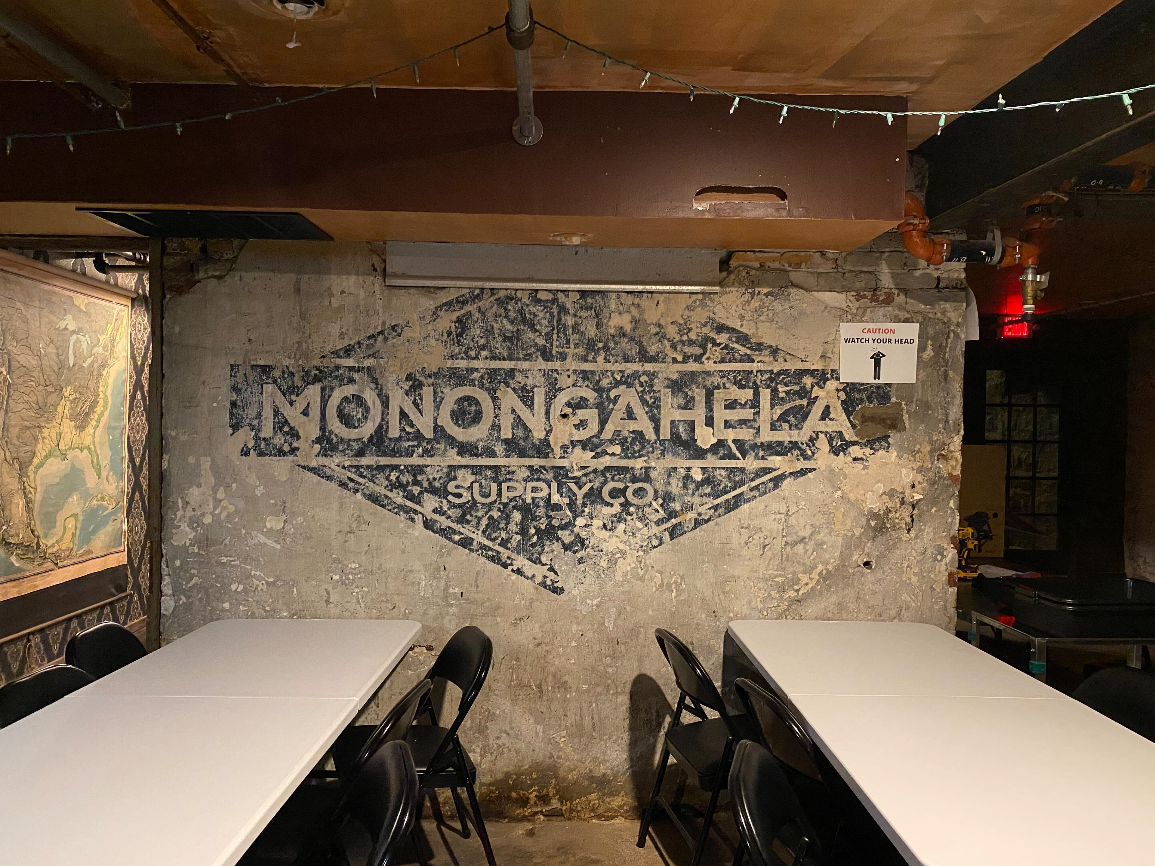
The main inspiration for the speakeasy's logo was on the walls of the basement. The old Supply Co.'s logo would be given a more luxurious revamp for selling craft cocktails rather than for selling industrial equipment.
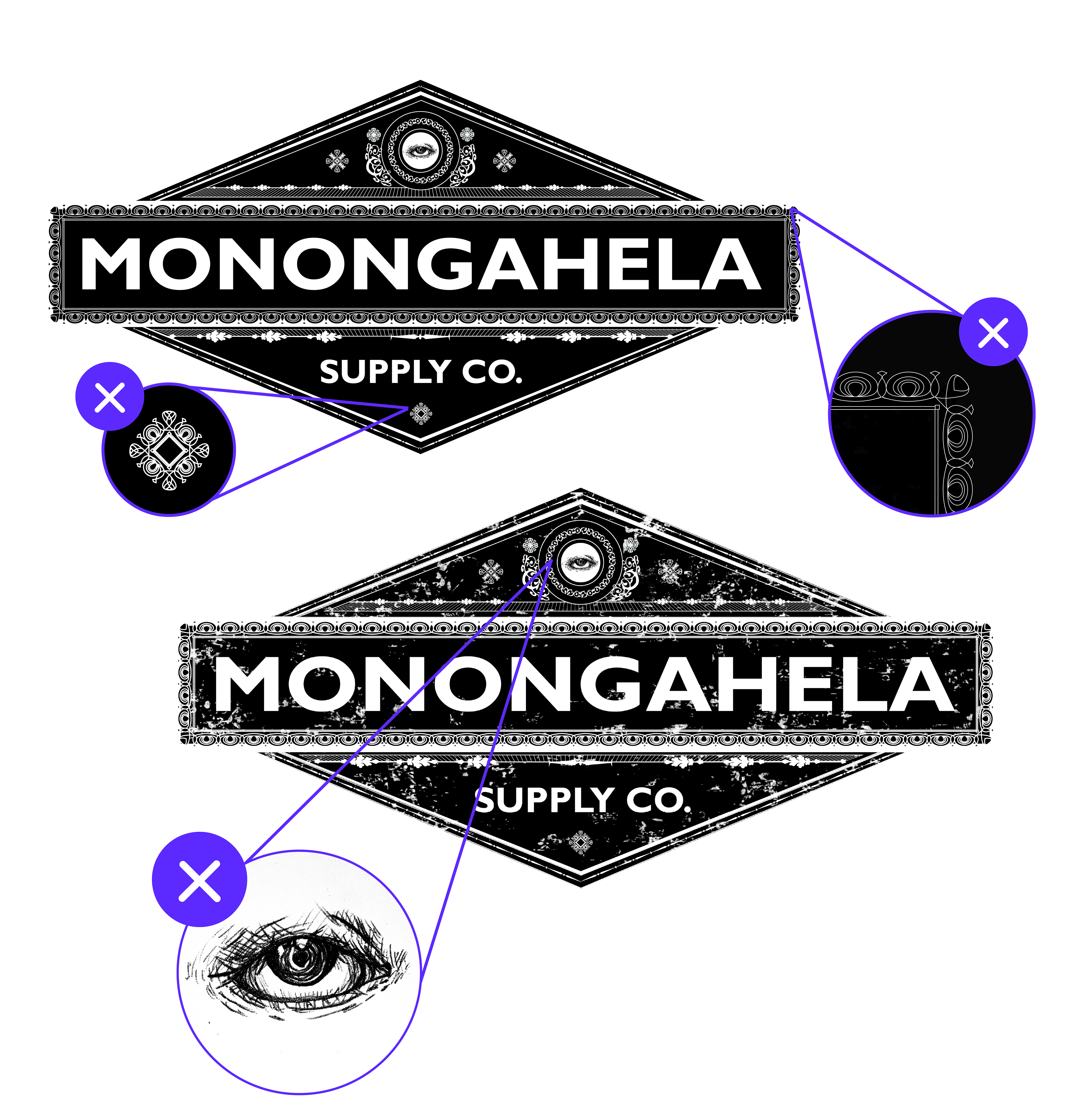
In early experiments, I kept the original font and shape, added decorative elements to give it a vintage look, and incorporated the texture of the paint chips on the wall. Because access to the speakeasy was granted by a Ring doorbell, a single eye in a peephole overlooks the logo.
However, scalability suffered. Both the eye and the minute details were way too small to be scaled down for a logo.
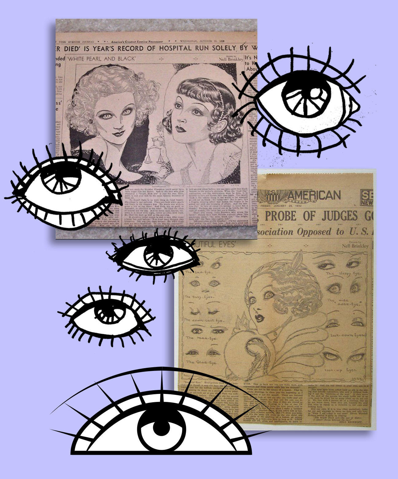
I referenced magazine clippings from the time period to capture the eye in a less detailed way for it to read better at different sizes. Now having a simpler iteration for the eye, I began recreating the rest of the logo.
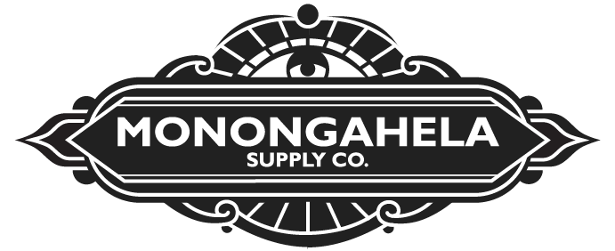
An eye overlooking an ornate set of black shapes, reading "Monongahela Supply Co." in the middle.
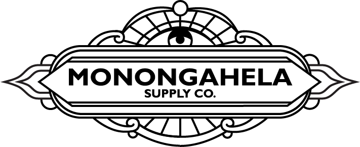
An eye overlooking an ornate set of white shapes, reading "Monongahela Supply Co." in the middle.
Rather than copying the exact shapes in the original logo, I changed the layout so the logo resembled a finger plate from doors of the time period with its shape and embellishments, alluding to the hidden side door that granted access to the speakeasy.
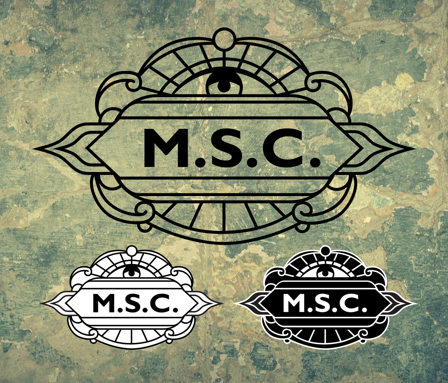
The title made the logo very wide, so I came up with alternate versions for condensing while still being recognizable.
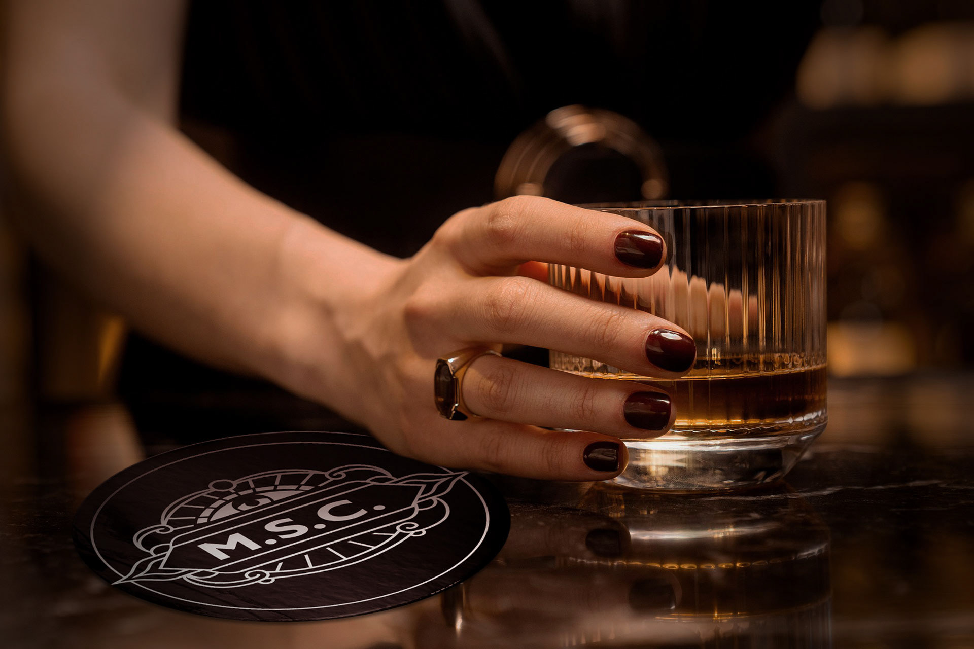
We used the new logo to develop some custom drink menus and explored how to use the graphics for coasters. We wanted the eye to remain present as a patron looked down through their glass at the coaster, an allusion to the hidden nature of the speakeasy.
The menu was kept short and simple, but again resembled a door finger plate in shape, similar to the logo.
I then developed a vague promo video to be published on their social media channels to spark engagement. While sadly Morgantown Brewing Company went under new ownership and eventually closed in early 2024, shutting down the speakeasy with it, the revival of the Monongahela Supply Co. as a vintage space for intimate craft cocktails and events was a success for its duration.