

The Benjamin M. Statler College of Engineering and Mineral Resources at West Virginia University pioneers innovation. Student labs and classrooms are high-tech, built for research, and sleek...but other spaces remain visually the same as when they were first built. This entrance to the Engineering Sciences Building, the tallest and most widely utilized building on the engineering campus, was not particularly inviting and didn't adhere well with WVU's new brand identity. I redesigned a vinyl wrap that spanned the entire hallway to renovate the space.
The view from the atrium, leading the path outside into the Engineering Sciences Building. Multiple sets of double glass doors separate the entrance from the main floor
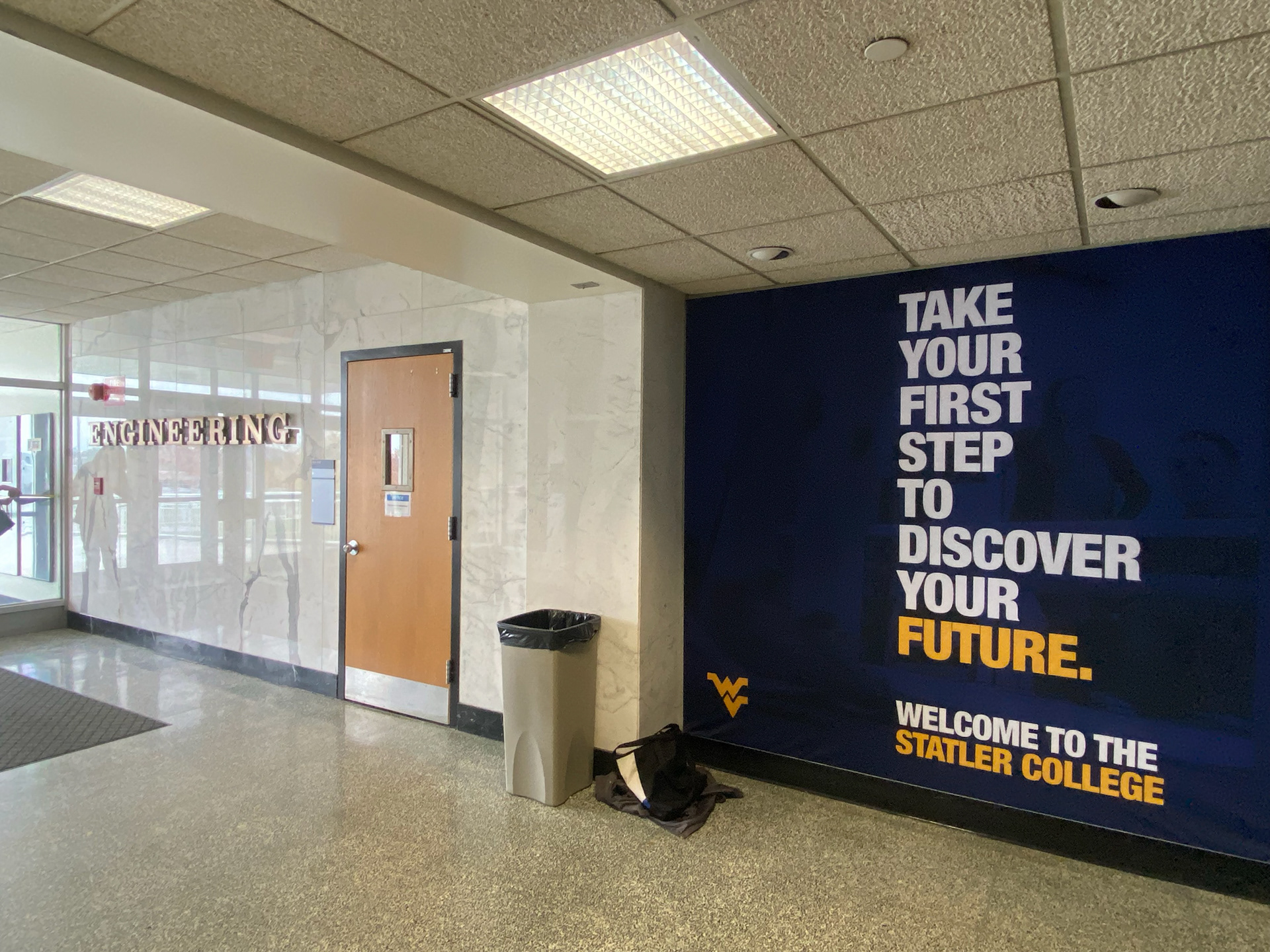
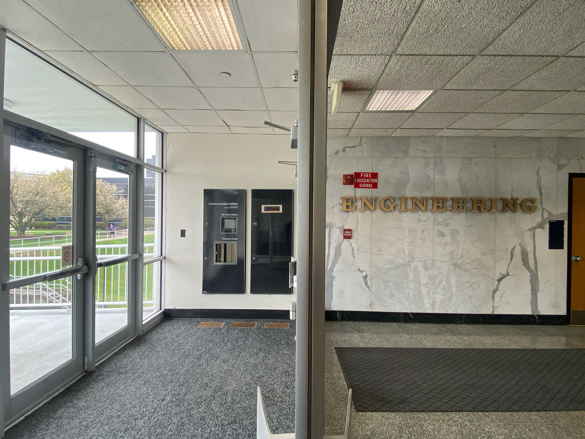
The left wall from the entrance to Engineering Sciences building, with a white marble wall with brass 3D letters spelling "ENGINEERING" and a dark navy fabric banner reading "Take your first step to discover your future."
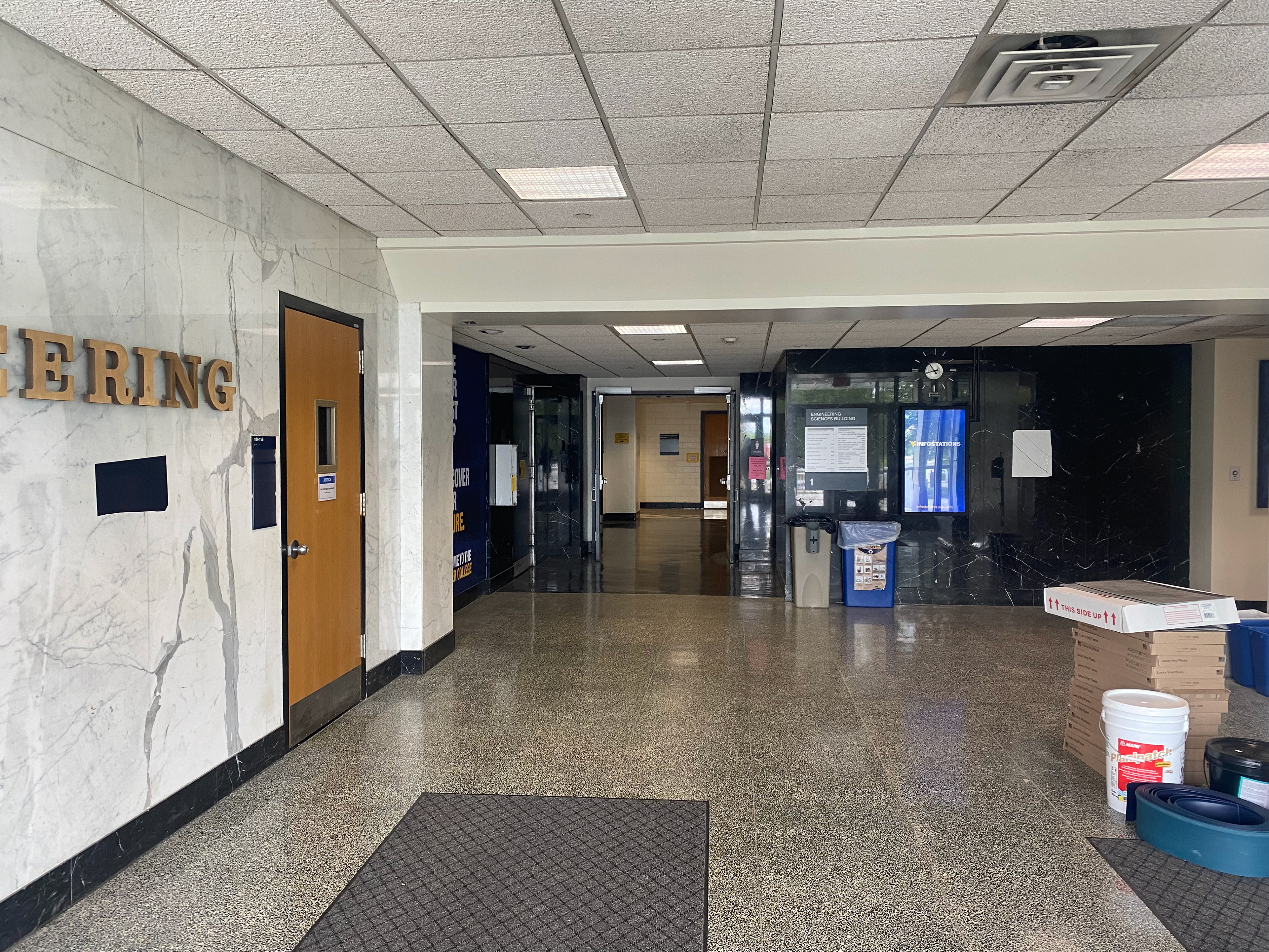
The main floor of Engineering Sciences Building from doors, with a single white marble wall to the left and several black marble walls stretching into the distance
The right side of the main floor in Engineering Sciences Building, a plain white wall with one white marble slab.
Aside from taking extensive measurements to account for fire alarms, doorways, awkward ceiling slants, etc., I had to examine how a student passes through this space. How much of the room do they see through the glass doors as they enter from the outside? If they study in the adjacent lounge to the right of the entrance, what would they be staring at in place of the brass "ENGINEERING" letters?
This informed my first sketches and drafts. I chose to execute a continuous graphic that wrapped around the entire space and covered both the white and black marble.
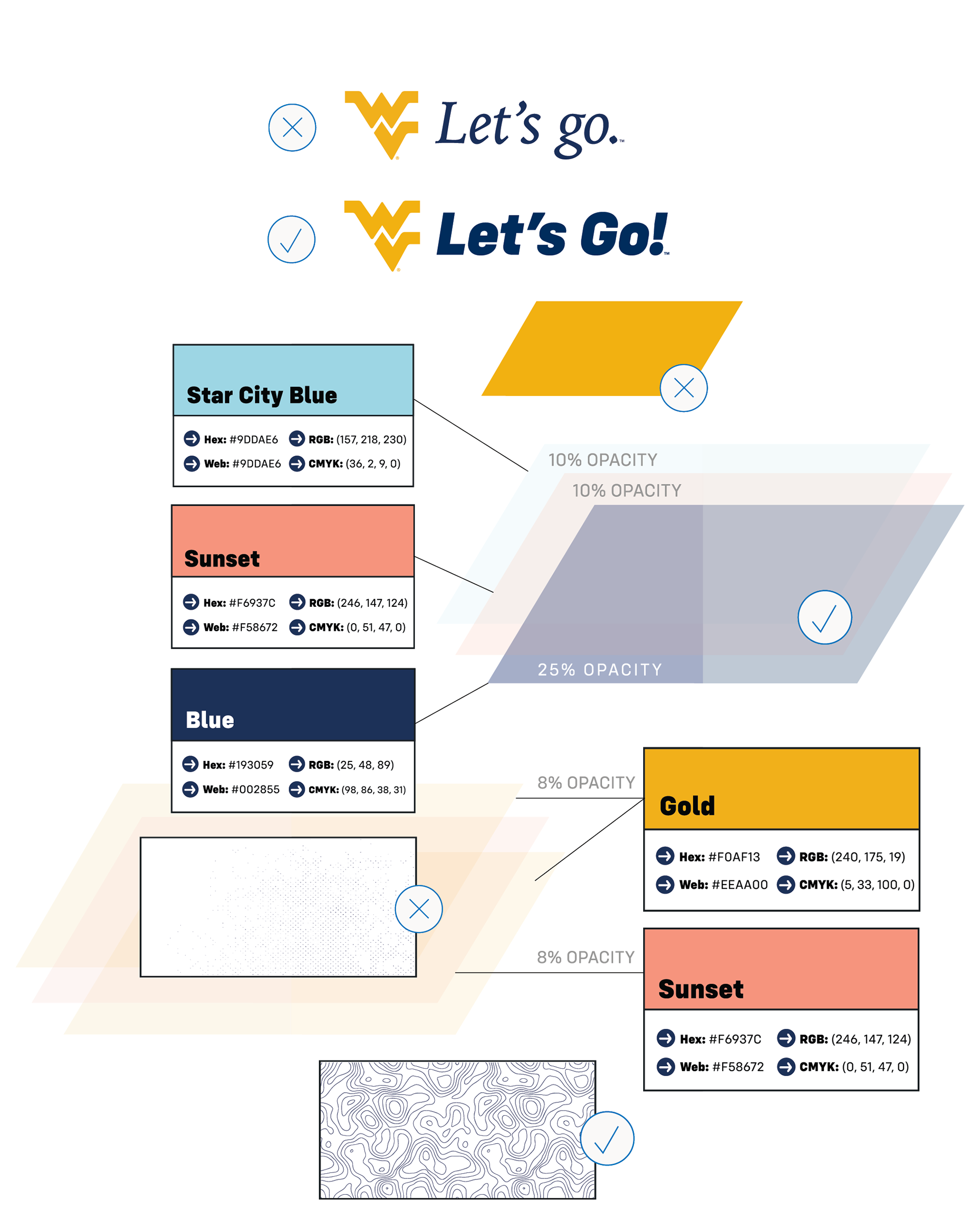
There were a lot of parameters to work around. WVU was in the middle of a rebrand, so while some fonts, colors, and elements were staying the same, others were changing drastically—but we didn't have confirmed details, and the project needed installed before then. I had to experiment within these guidelines to see what would work, from slogans to textures to fonts and more.
We also only had a few months from start to finish to complete the final design due to budgetary constraints. My design had to be clean, accurately measured, and scaled correctly, and I had to communicate frequently with other departments and vendors for proper approvals as we went.
This was also my first ever environmental graphic. All of these challenges made this project a massive undertaking to complete in just several months.
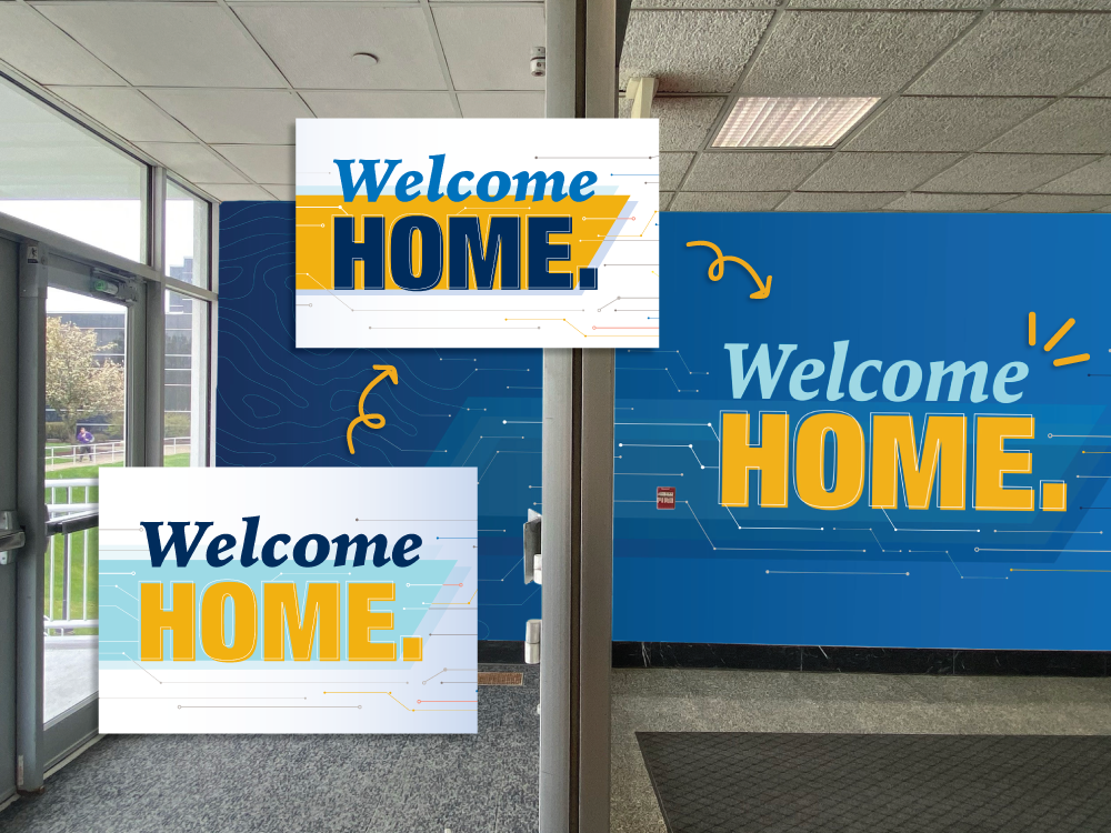
Welcome Home mockup on royal blue wall; previous versions change the 'welcome' from dark blue to royal blue to finally pale blue, and the slash has become transparent overlays instead of a solid color.
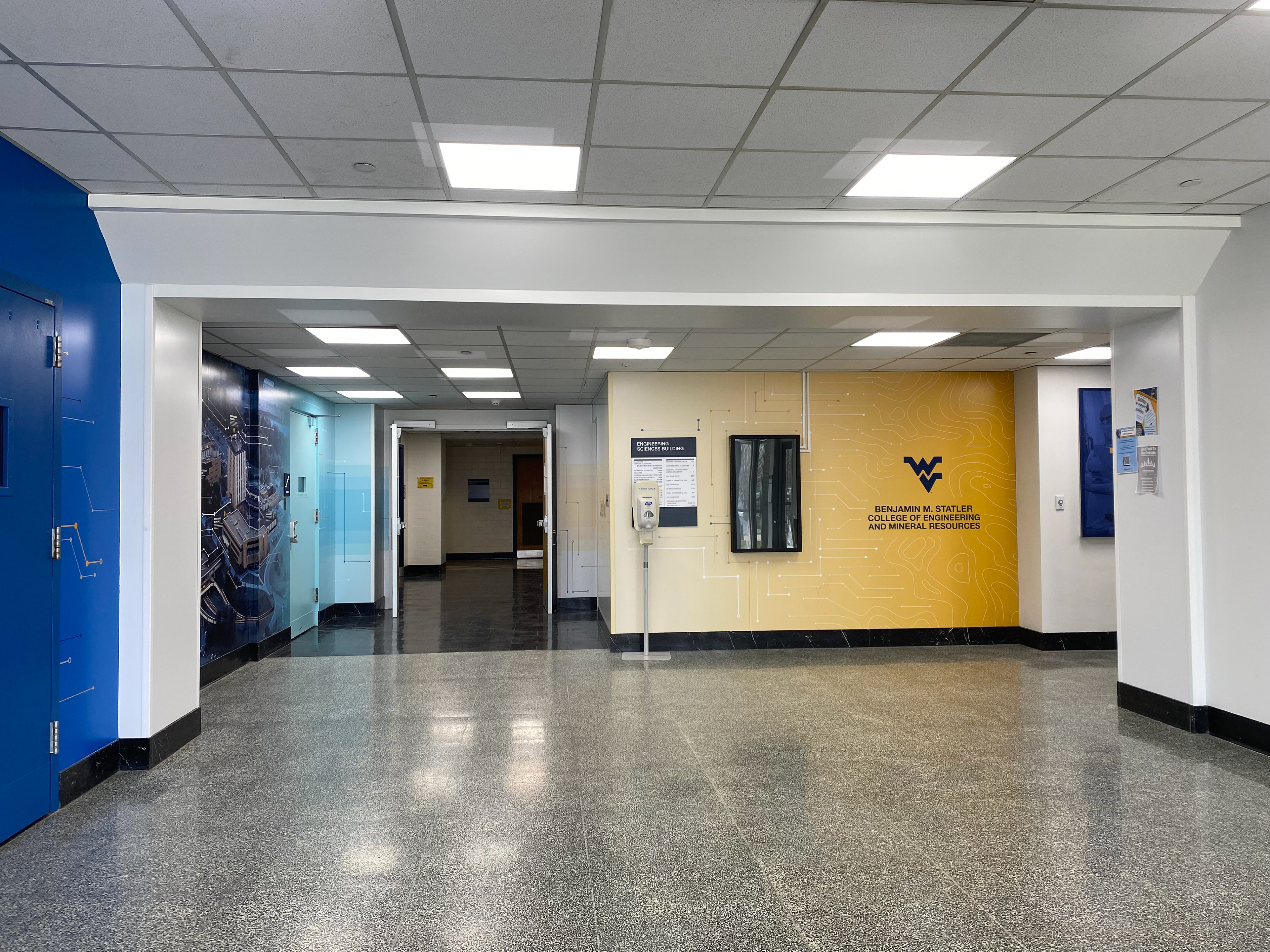
The final wall section has circuits fading into a topography texture with the full college logo rather than just a flying WV on a solid shape.
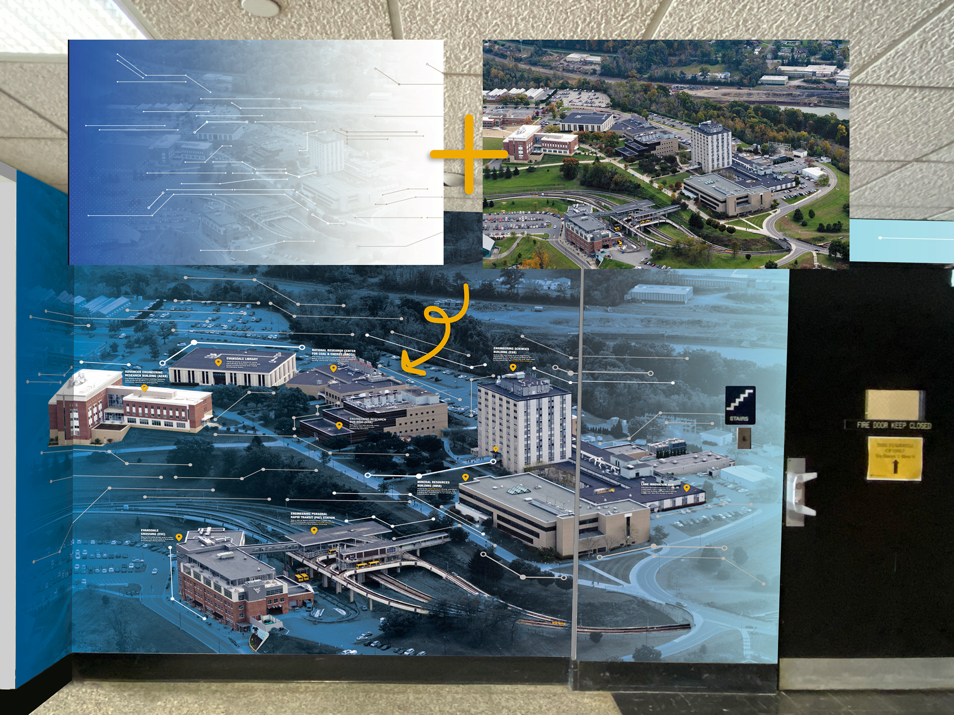
The blue to white gradient and circuits plus an aerial image of campus are added and the buildings are full color with location markers and fun facts.
I made a lot of iterations and worked closely with the Statler Marketing & Communication department and WVU's Strategic Communications and Marketing team to examine what would work. To install such a large-scale vinyl wrap would be time consuming and expensive; I couldn't make any design choices that would out-date my work within a year or two.
While designing in Illustrator, I simultaneously created mock-ups to ensure the continuous graphic looked how we wanted as you move through the space. With this much vinyl and little room for reprints or errors, it was important to get as many mock-ups as possible before installing so that everything went smoothly.
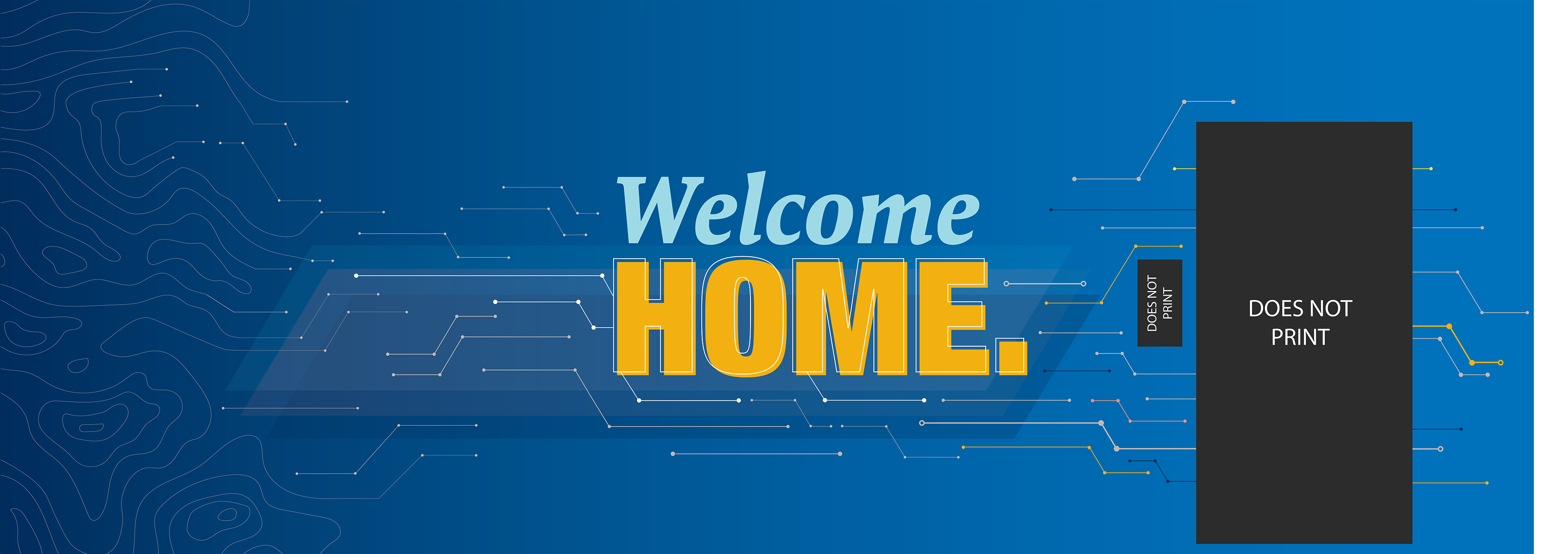
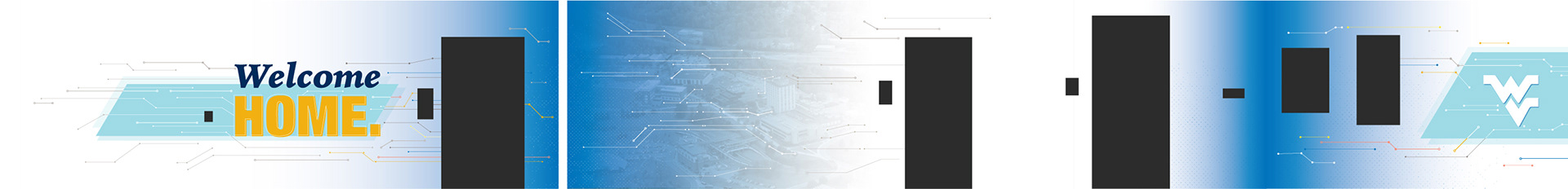
The first section of the final Welcome Home wall. Topography lines merge into circuit endings, travelling to the words "Welcome home".
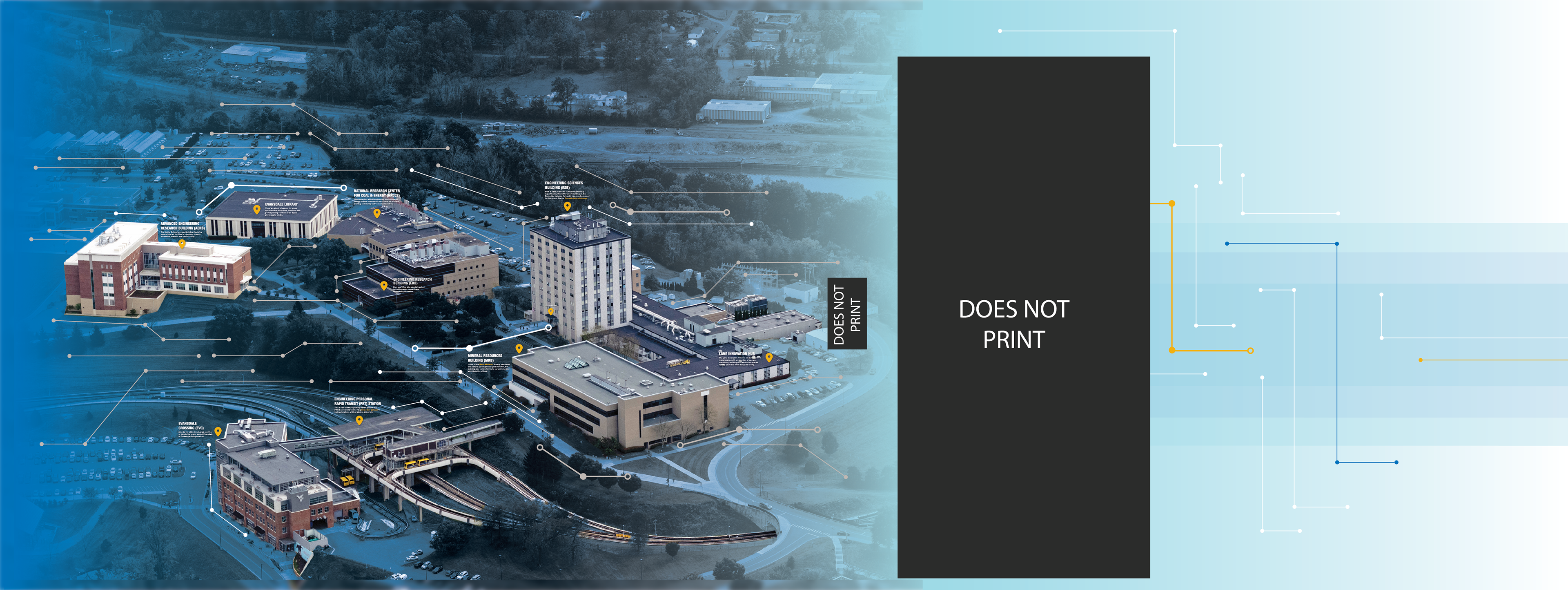
The second section of the final Welcome Home wall. A full color overlay of campus buildings, with location markers and fun facts for each building, overlaying a blue gradient and circuits that lead the eye to the next part of the wall.
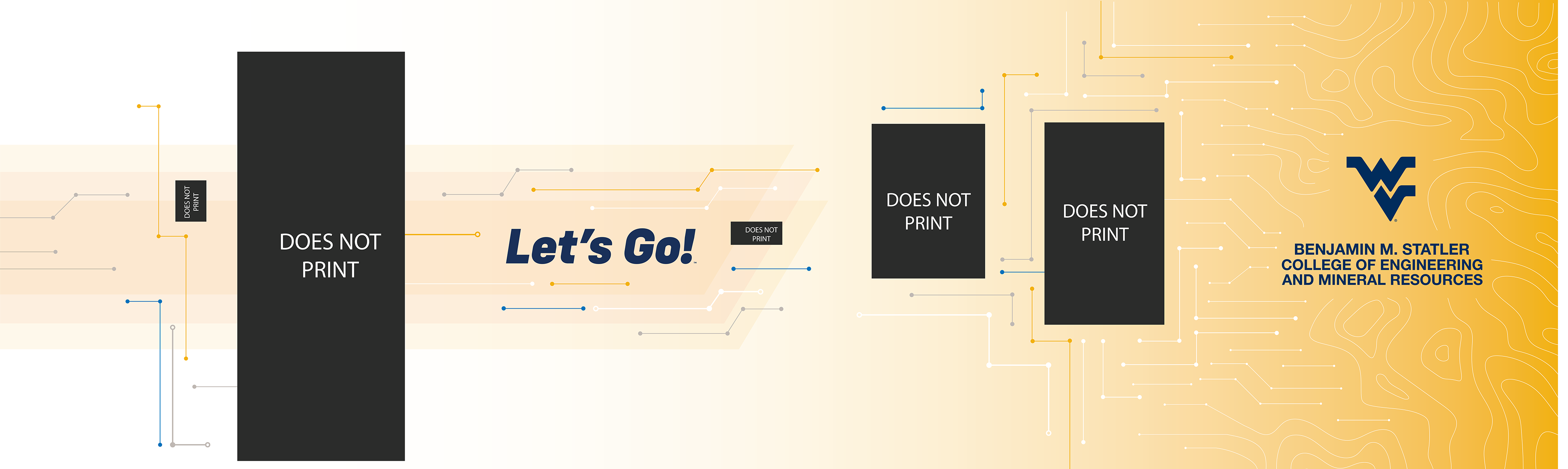
The circuits from the previous wall lead you to the "Let's Go!" logo, and the wall begins to fade to yellow. Circuits lead back into topography as the Statler College logo ends the wall graphics.
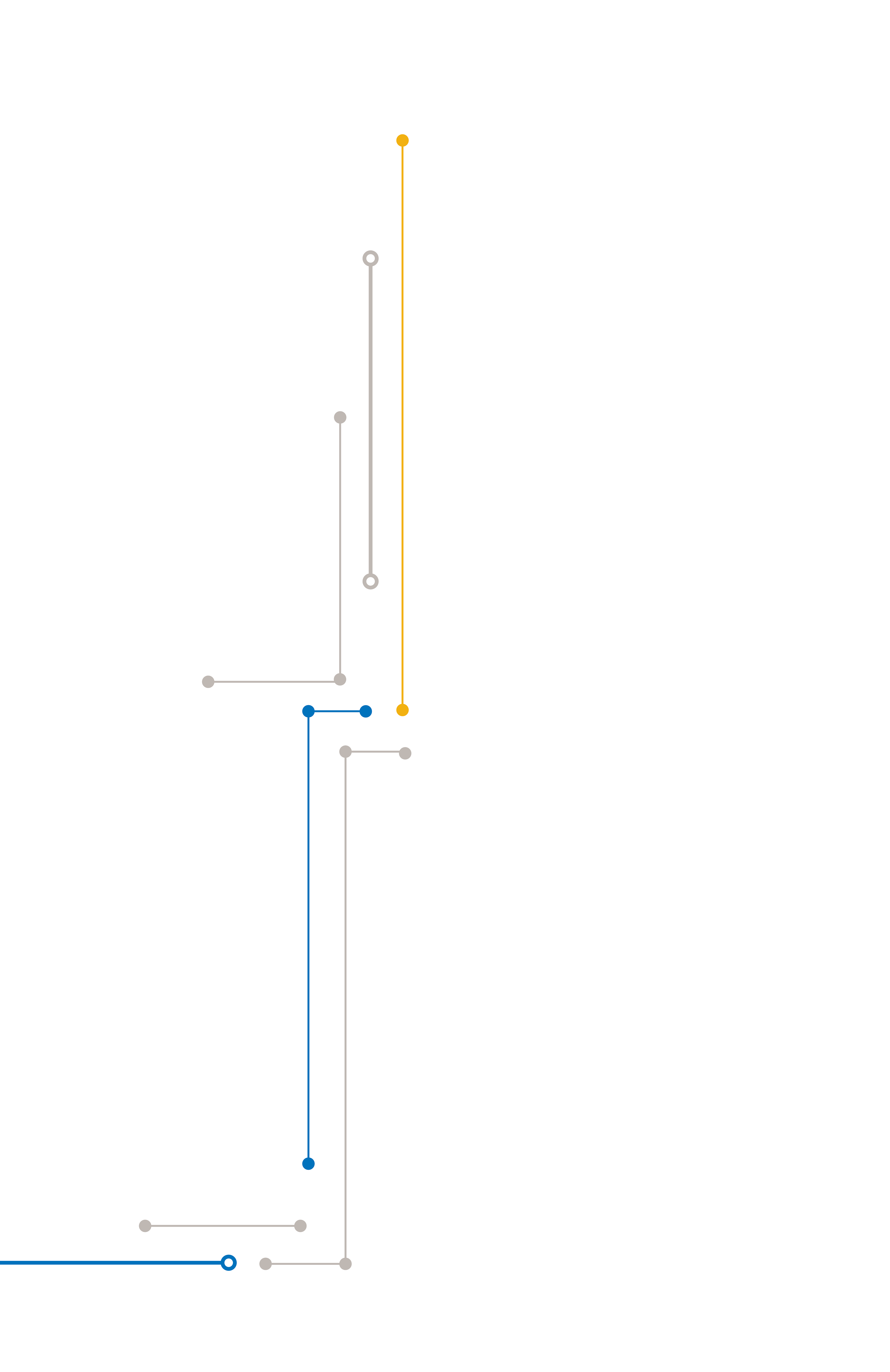
A small section of circuits to cover the remaining marble wall unattached to any previous wall.
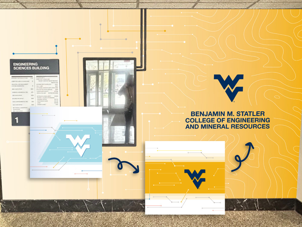
My design highlighted WVU's digital signage system (in the third picture above), provided an in-depth aerial map of the engineering campus, and combined familiar WVU brand components with ones specific to Statler. The result not only brightens up the area so that it truly reflects the innovation in the college, but fits within WVU branding while still having its own flair unique to the engineering college.
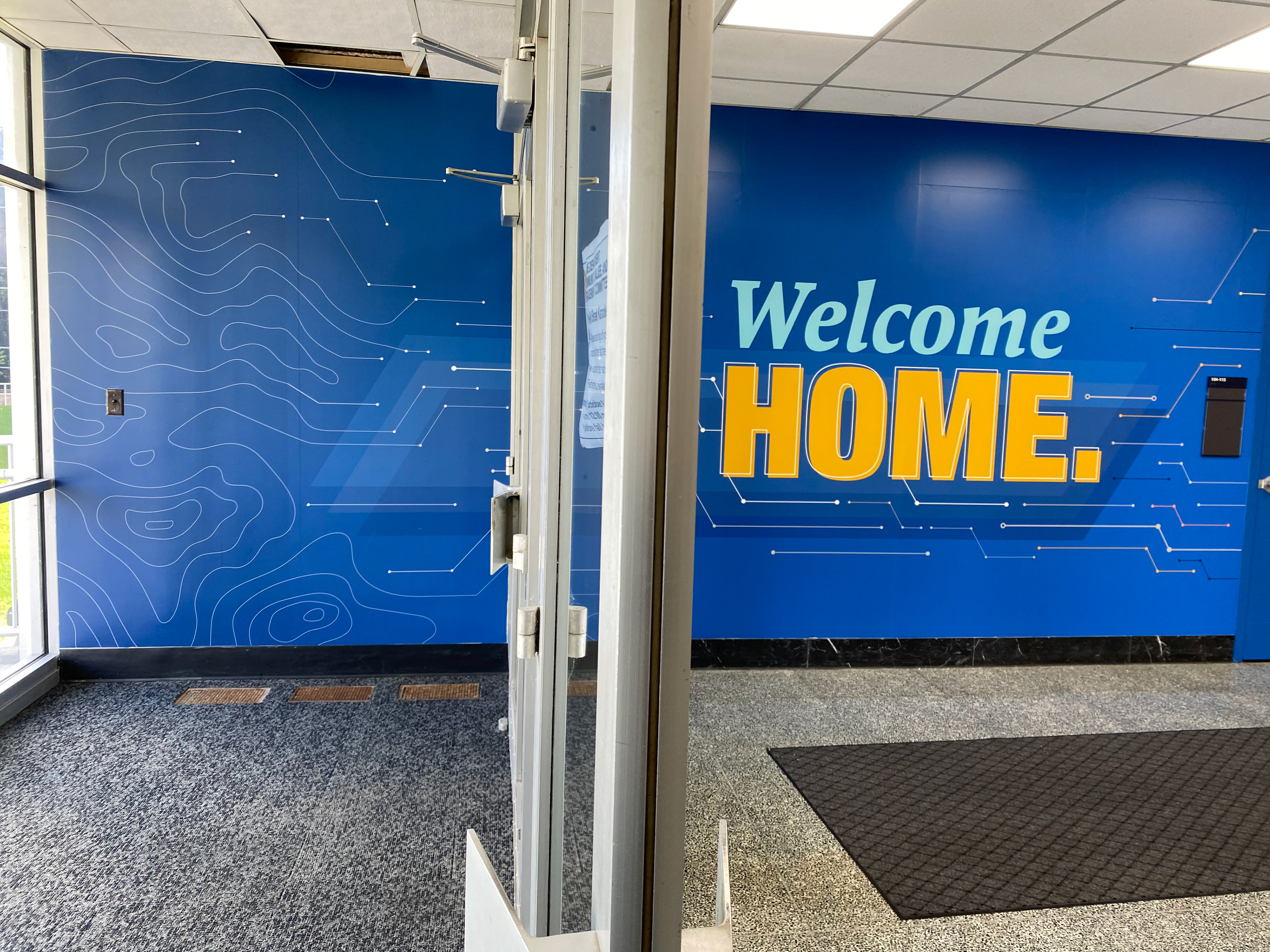
Photo of the first section of the installed wall from the glass entrance doors.
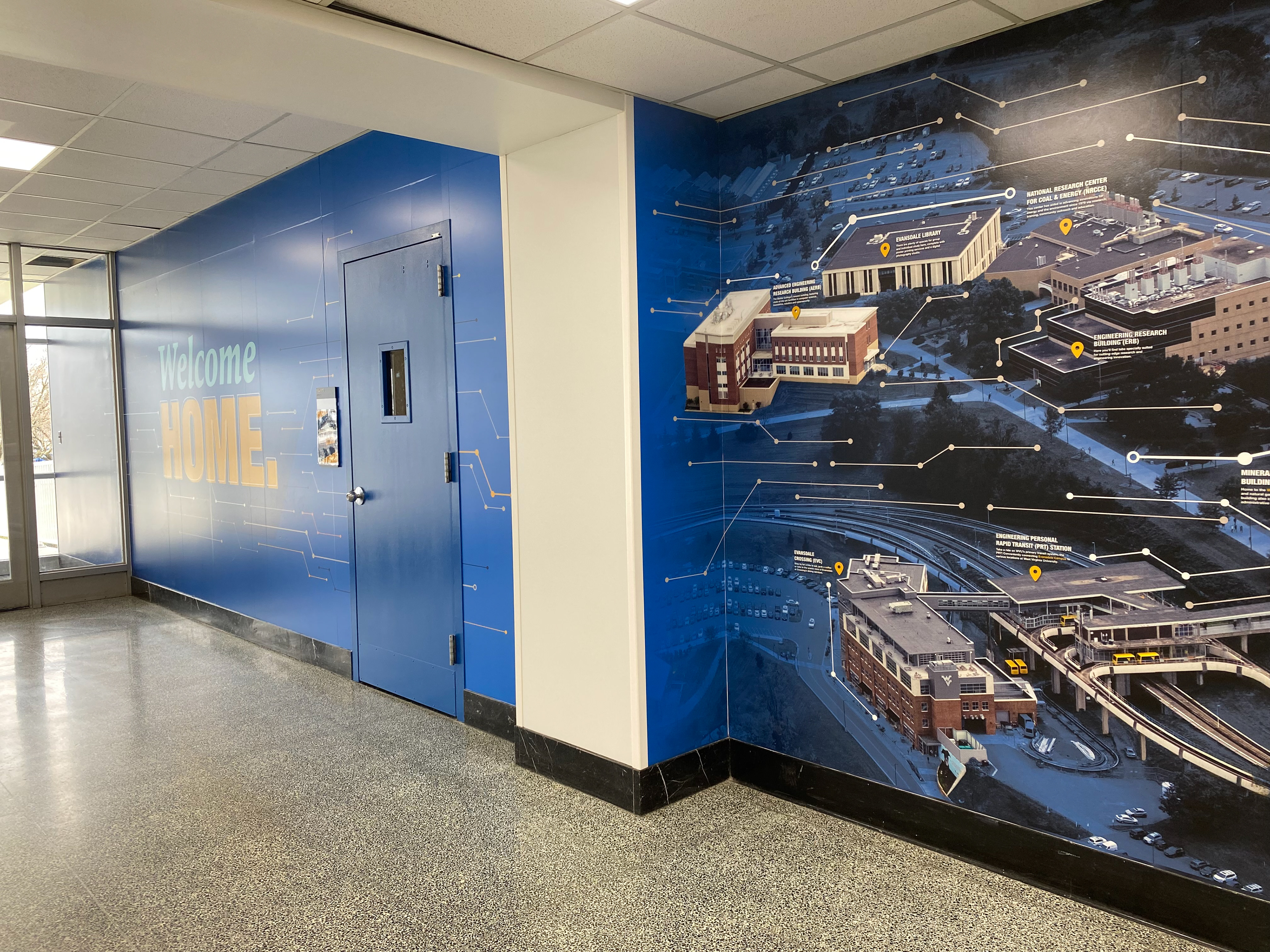
Photo of the second section of the installed wall, where the graphic turns into the aerial of campus.
An overview of all walls as they appear after the vinyl has been installed; the space is much brighter and colorful, and no longer swallows the light.
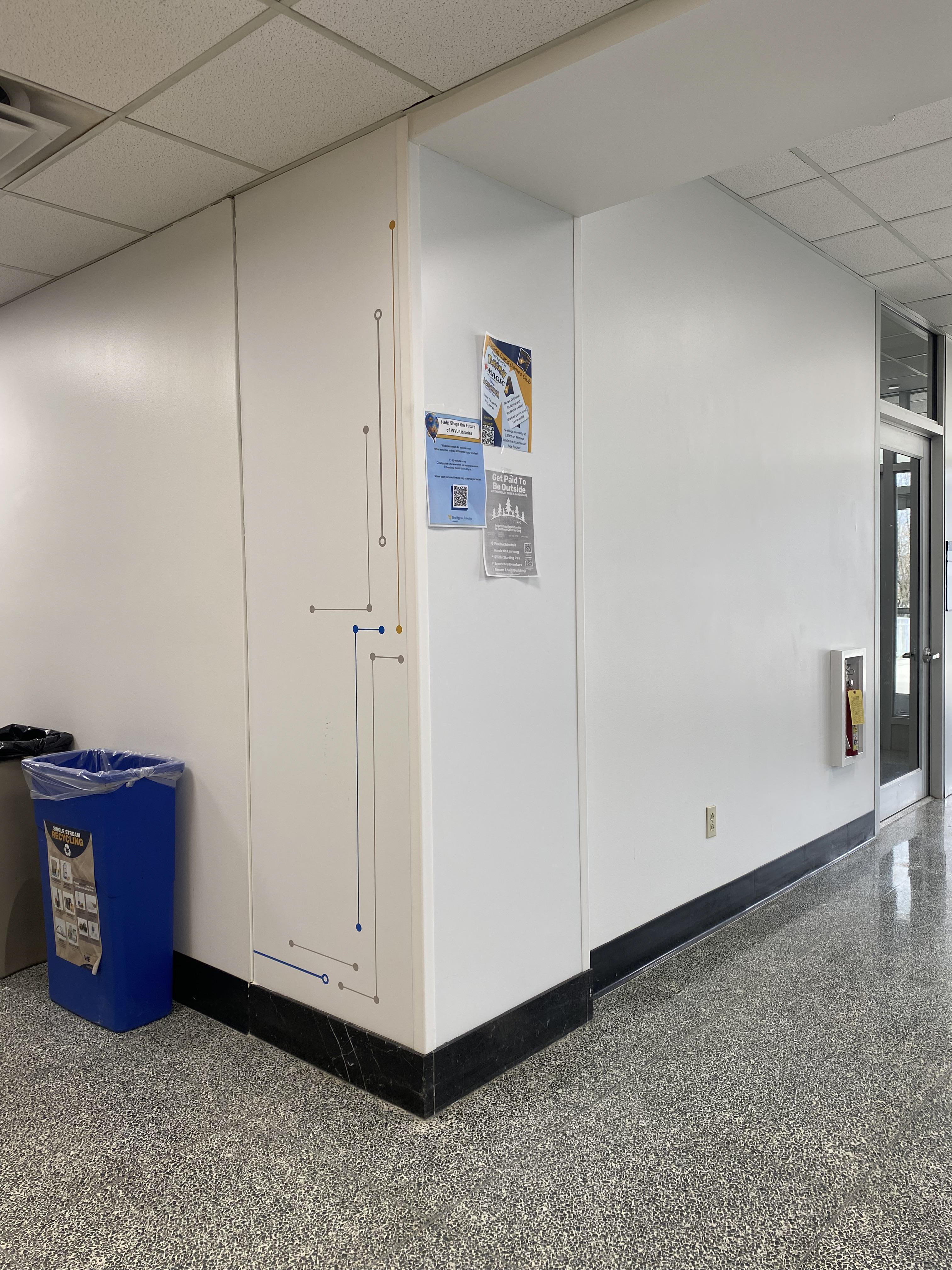
The random section of marble wall is covered by a white graphic with a few circuits that look similar to the ones on the other walls.
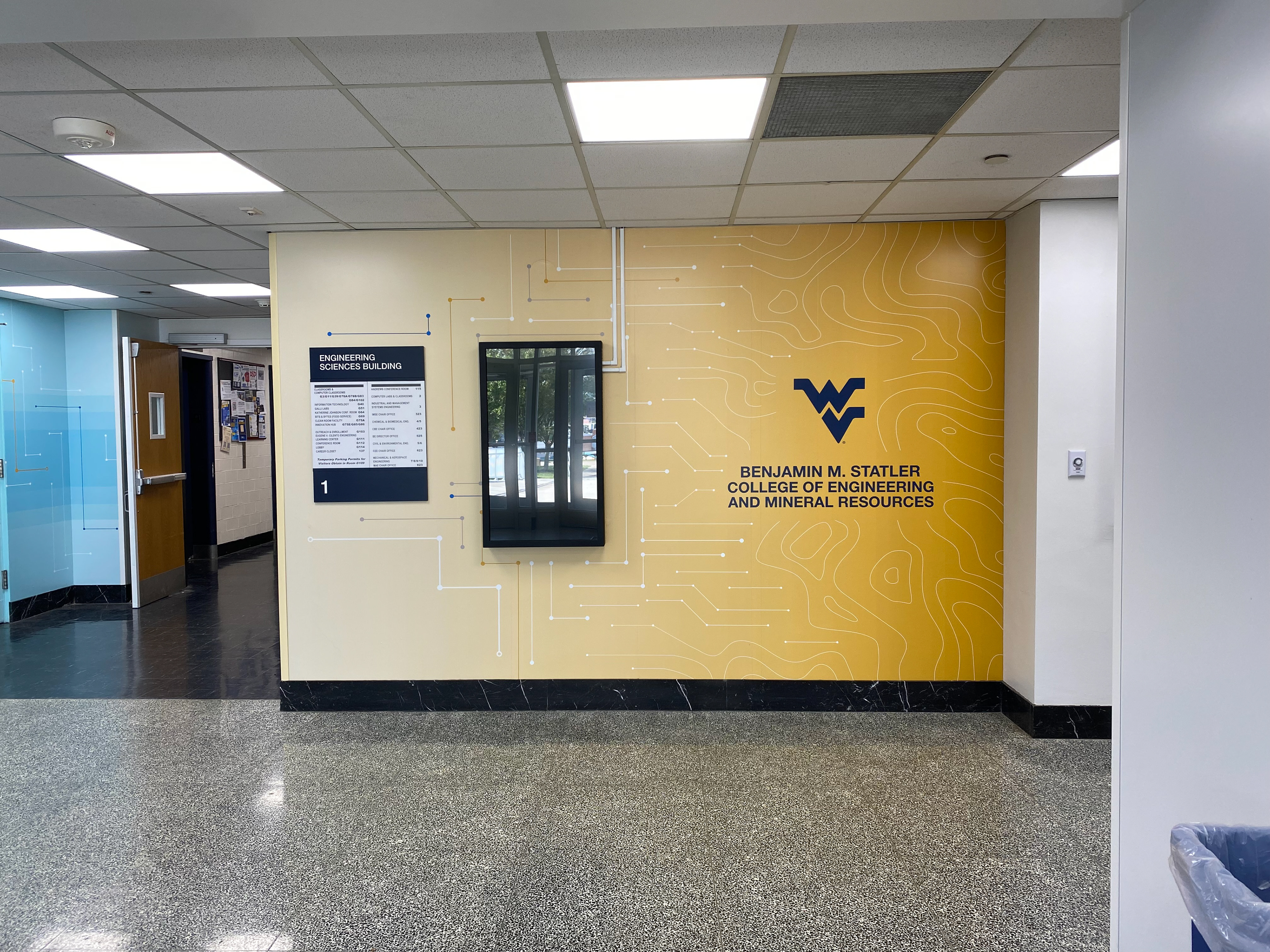
The last section of the installed wall, with the digital signage monitor reinstalled back over the vinyl. The circuits in the design wrap around it and the college logo ends the segment.
The final space is vibrant, more welcoming, and makes it easier for new students to navigate campus, with an aerial graphic containing campus landmarks. More than that, it modernizes an already well-loved building so that plenty of future students can feel proud to be a part of this college whenever they pass through.